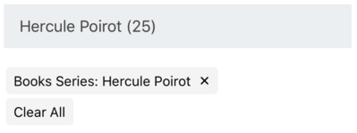
SelectedFilters creates a selectable filter UI view displaying the current selected values from other components. This component is useful for improving selection accessibility of other components.
Example uses:
- displaying all the user selected facet filters together in the main view area for better accessibility.
- building mobile responsive views where it is not practical to show all the UI components in the main view.
Usage
Basic Usage
<SelectedFilters />Usage with All Props
<SelectedFilters showClearAll={true} clearAllLabel="Clear filters" />Props
- showClearAll
boolean[optional] (defaults totrue) When set totrue, displays an additional button to clear all the filters - clearAllLabel
string[optional] (defaults to'Clear All') Sets the label for the clear all button.
Most ReactiveSearch filter components have a prop showFilter (defaults to true) which can be used to control whether the component's selected state appears in the SelectedFilters component. There is also a filterLabel prop which controls how that component is displayed.
Note
The
showFilterandfilterLabelprop updates are only reflected if the underlying query of the associated component has changed.
As an example, check SingleDropdownList usage to see how showFilter and filterLabel can be used.
Demo
Styles
SelectedFilters component supports style prop. Read more about it here.
Extending
SelectedFilters component can be extended to customize the look and feel with style.
<SelectedFilters style={{ paddingBottom: 10 }} />- style
ObjectCSS styles to be applied to the SelectedFilters component.


